


Phase 01
Foundation
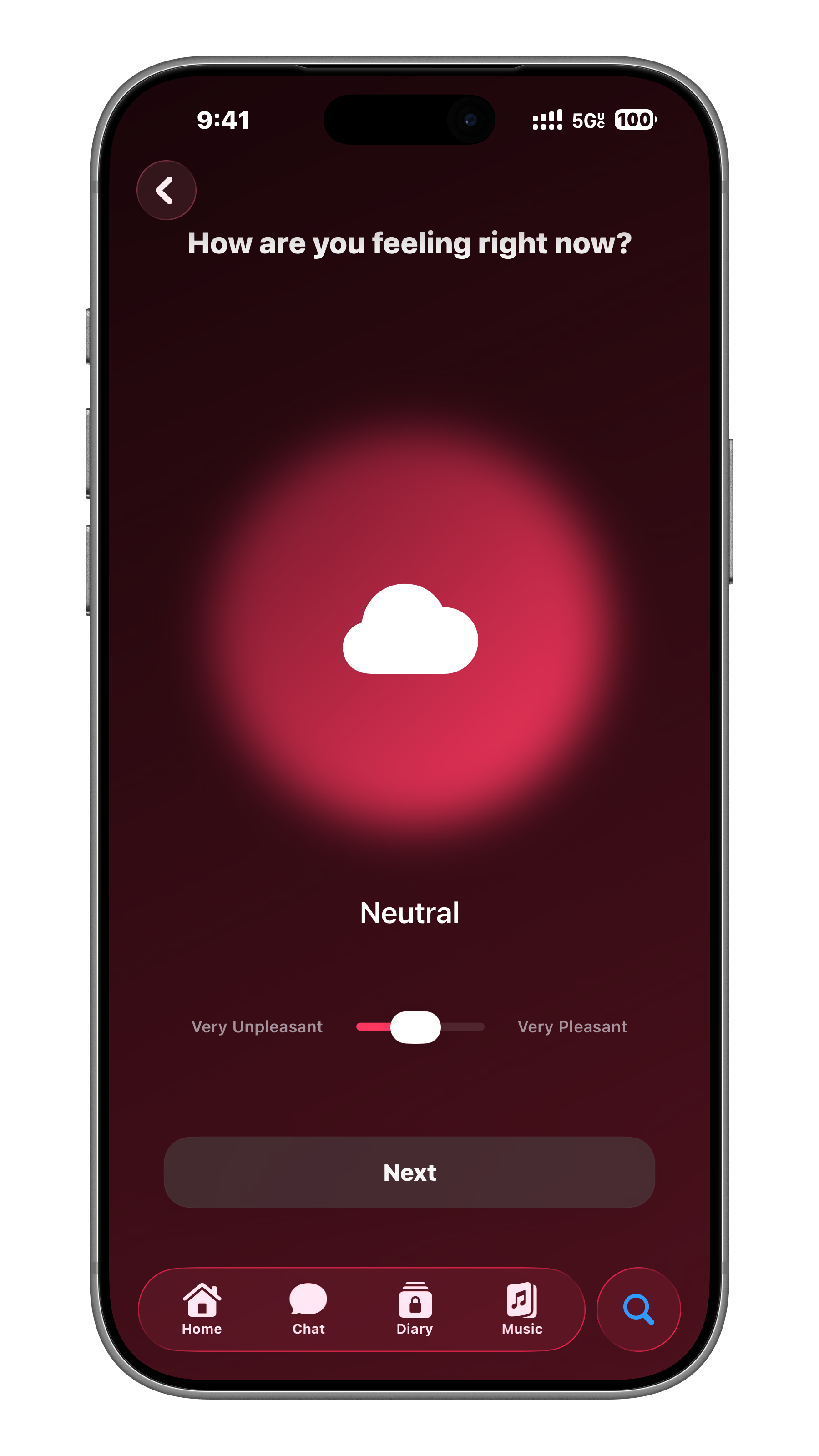
The first layer focuses on presence, emotional check-ins, simple routines and a product language that feels calm from the first interaction.
- Core mood and reflection system
- Personal onboarding flow
- Daily rhythm and guided prompts